

This July, Quilt Scouts are going full trail guide mode—with fabric pulls in one hand and color wheels in the other. Our featured badge of the month is Color Palette Pro, and we’re celebrating with a members-only color challenge that draws inspiration from the crown jewels of America’s National Parks.
We’re calling it: Patchwork from the Parks.
Each week in July, Quilt Scout members will get a fresh color palette inspired by a different park—plus planning tools, creative prompts, and color theory lessons to help them explore (and earn that badge!).
Not a member yet? No worries—we’ve got a sneak peek of the palettes below, just enough to whet your creative appetite.
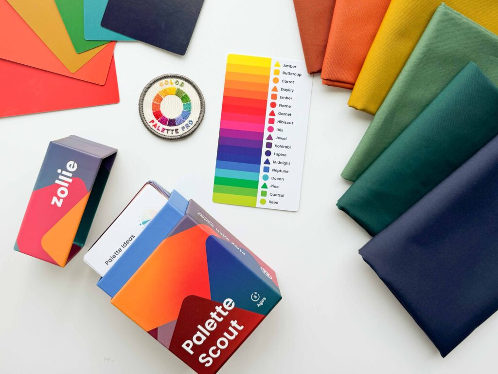
What Members Get
This challenge is part of our exclusive Quilt Scouts membership. If you’re a member, you’ll get access to:
- Weekly prompts
- A Color Theory Guide for Quilters – a Scout-tested, newbie-friendly guide to hue, value, saturation, and harmony
- Palette Planning Tools for swatching and pulling fabric with purpose
- Weekly group threads inside the Quilt Scouts portal to share fabric pulls, mockups, and color experiments
- The chance to earn your Color Palette Pro badge!
Sneak Peek: The National Parks Trail Map
While the full experience is members-only, we’re giving you a look at our July adventure map so you can follow along, get inspired, and maybe even join in next time.
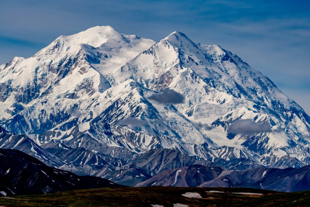
Week 1: Denali National Park
Week explores the monochromatic colors of icy glacial blues, periwinkle skies, and stormy shadows. This cool-toned palette builds depth and drama using just one slice of the color wheel.
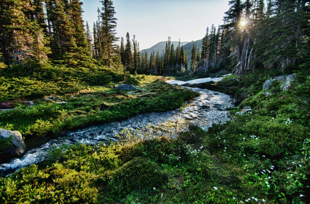
Week 2: Olympic National Park
This week features an analogous color palette of lush greens, moody blues, and foggy purples—pulled straight from Olympic’s coastal rainforests and misty peaks.
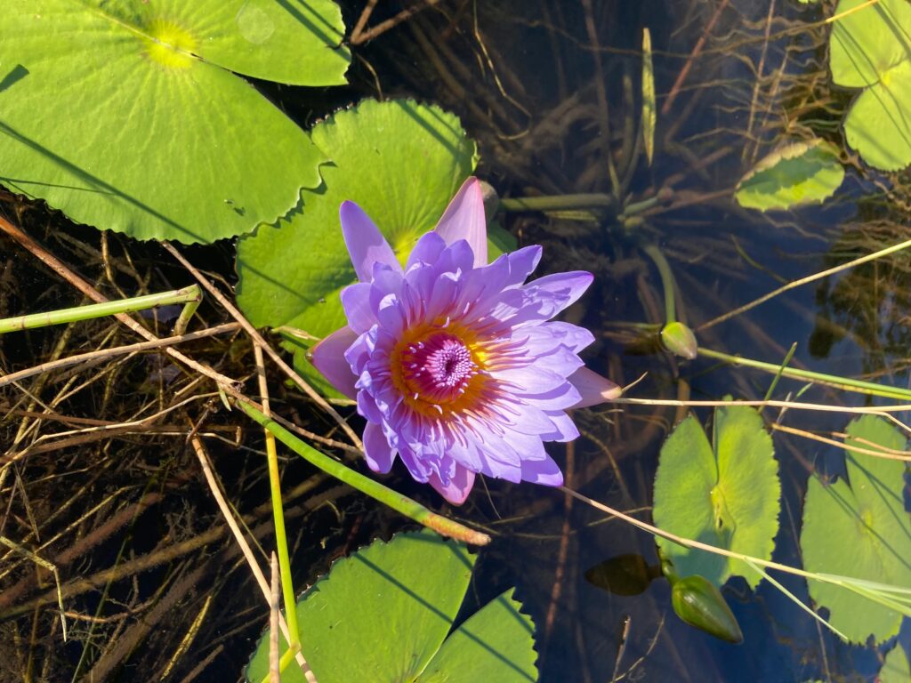
Week 3: Everglades National Park
This complementary color palette of tropical greens and bold magentas pops. Inspired by the wild contrast of flora and fauna in the Florida wetlands.
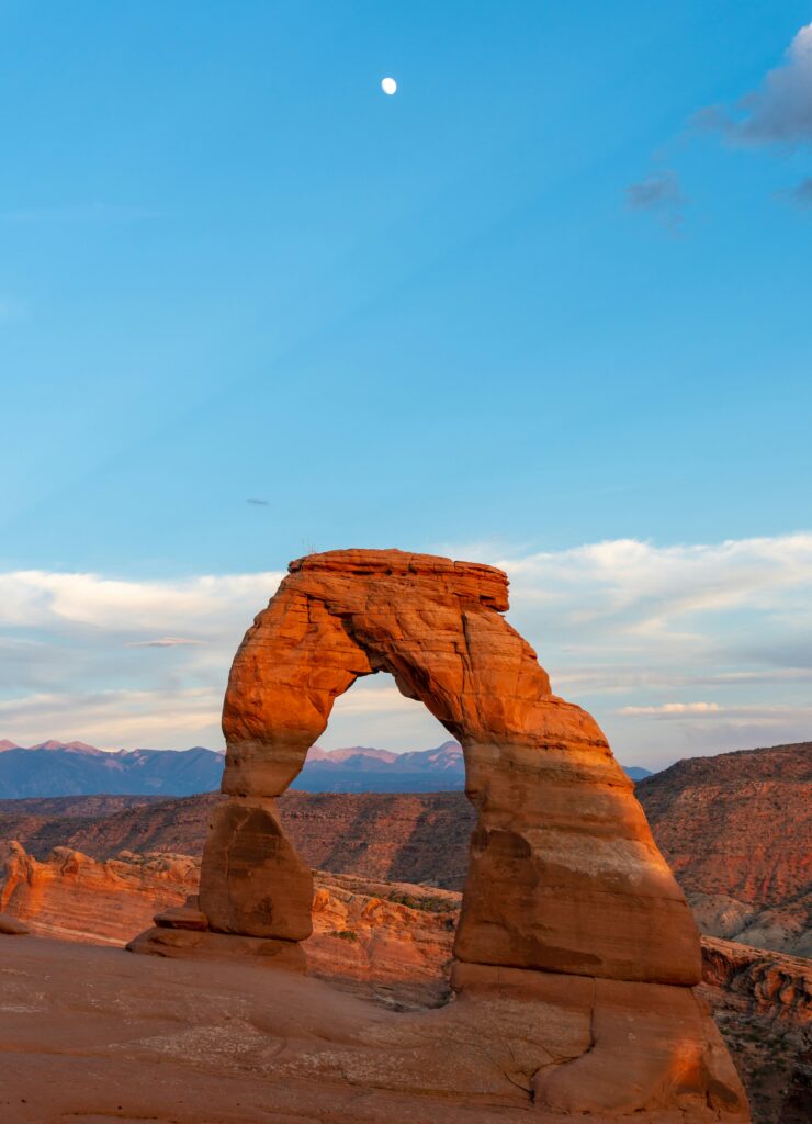
Week 4: Arches National Park
Red rocks, clay cliffs, and teal skies. This week explores a split complementary color palette.
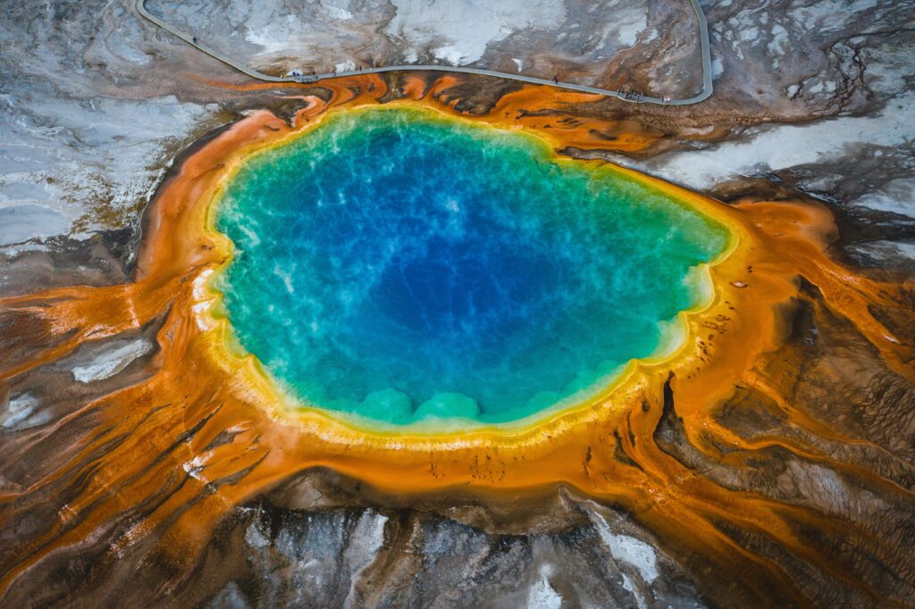
Bonus: Yellowstone National Park
Grand Prismatic glory! a triadic color palette of teal, golden orange, and dusty fuchsia combine for a vibrant finish inspired by Yellowstone’s most jaw-dropping natural wonder.
Ready to Join the Troop?
If your inner color nerd is screaming “YES,” come on in. Quilt Scouts members get this challenge plus a new badge every month, tutorials, printables, and the best darn community of quilters this side of the Smokies.
Psst… want in? Try Quilt Scouts free for 7 days and earn your Color Palette Pro badge while you play! 🌈
Free Download: Aurifil + AGF Color Matching Guide
Want to take your color game to the next level? We made a handy little guide to help you match Aurifil thread colors to Art Gallery Fabrics’ solids—because there’s nothing worse than auditioning a dozen spools under weird lighting. 😩

This printable chart is perfect for:
- Planning your quilting + binding combos
- Pulling thread for embroidery or EPP
- Leveling up your palette challenge results like a true Color Palette Pro
🎨 Instant download, totally free.
Just enter your email and we’ll send it your way!


+ show Comments
- Hide Comments
add a comment